
THE ASSIGNMENT
The assignment was to create a series of three or more books. We were also required to at least consider how they would be distributed. It was encouraged to distribute them in some unusual way, not in a bookstore. Because of the distribution, we were required to make at least two full sets.

MY IDEA
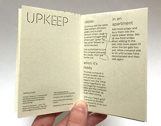
I decided on doing my books on composting. One about what to compost, one about how, and one about why. The books would be made in a zine style: only eight pages and made from one side of one sheet of paper. This would save paper and create less waste. The fonts and paper chosen also reflect the idea of helping the environment and minimizing waste, the fonts are detailed below, and the paper was 100% recycled. Each book would unfold into a poster, and for all the posters to connect into a bigger poster. I intended to distribute them at the local farmers market and to the professor who had inspired me to do this topic.

TYPOGRAPHY
The typefaces used in this project are Aribau Grotesk designed by Eduardo Manso and Interlink designed by Julie Soudanne. These typefaces were chosen because of their minimal ink usage. Aribau Grotesk is only used in its thinnest weights, and Interlink features interruptions in the stroke as well as an overwhelming number of ligatures, which both add to limiting it’s ink usage. Saving ink means that less energy is used in printing.


THE BOOKS
Inside the books was information on each topic heavily broken down (pun intended) into three basic ideas. "WHAT" included "what to compost," "nitrogen and carbon," and "what not to compost." "HOW" included "picking a place," "getting started," and "upkeep." "WHY" included "it helps the planet," "it helps the soil," and "it helps you." Throughout the books were icons with breaks in the stroke to mimic the breaks in Interlink.
THE POSTERS
The posters had all or most of the information found inside the book, just reorganized into a poster. The three of them fit together to create one larger poster. WHAT and HOW had a dotted line to fold along so that the two of them together created the top half of the poster. They were folded so that together they would be the same width as WHY, which didn't need any folding. This was to make sure the poster was a good size and proportion.


DISTRIBUTION
I attended the local farmers market in the hopes of giving my books to people who cared about farming and gardening and waste reduction. Unfortunately, I attended on Art Saturday and everyone there was a local artist. None of them were particularly interested in composting. I did find one booth for an artist selling terrariums and gave her a copy, pictured here. She didn't know anything about composting before, but I'm sure she does now. The professor that I had talked to that originally inspired me to talk about this topic is the president of the horticultural club and a professor in the agriculture department. I gave her the left over copies as well as the original files and instructions on how to put them together. She expressed intentions to give them to her students and to distribute them at events related to the horticultural club, as well as on earth day.

IN THE END
I'm excited and proud of my final product. I learned how to combine my skills with book design and branding and I practiced making a system. I learned a lot about composting as I was researching and narrowing my information down time and time again. I enjoyed finding ways to connect all parts of the design to the topic, from the fonts to the paper to the look of the icons. I'm excited to see where it goes next as far as distribution, and I'm excited for the next series I get to design and the next time I get to distribute my work in an untraditional way.
There was a lot of trial and error in this book. It took me a minute to even settle on an idea, nonetheless fonts and layouts. See all the steps from behind the scenes in my process book.
Click here to view it in a new window.


